Rebrand Project
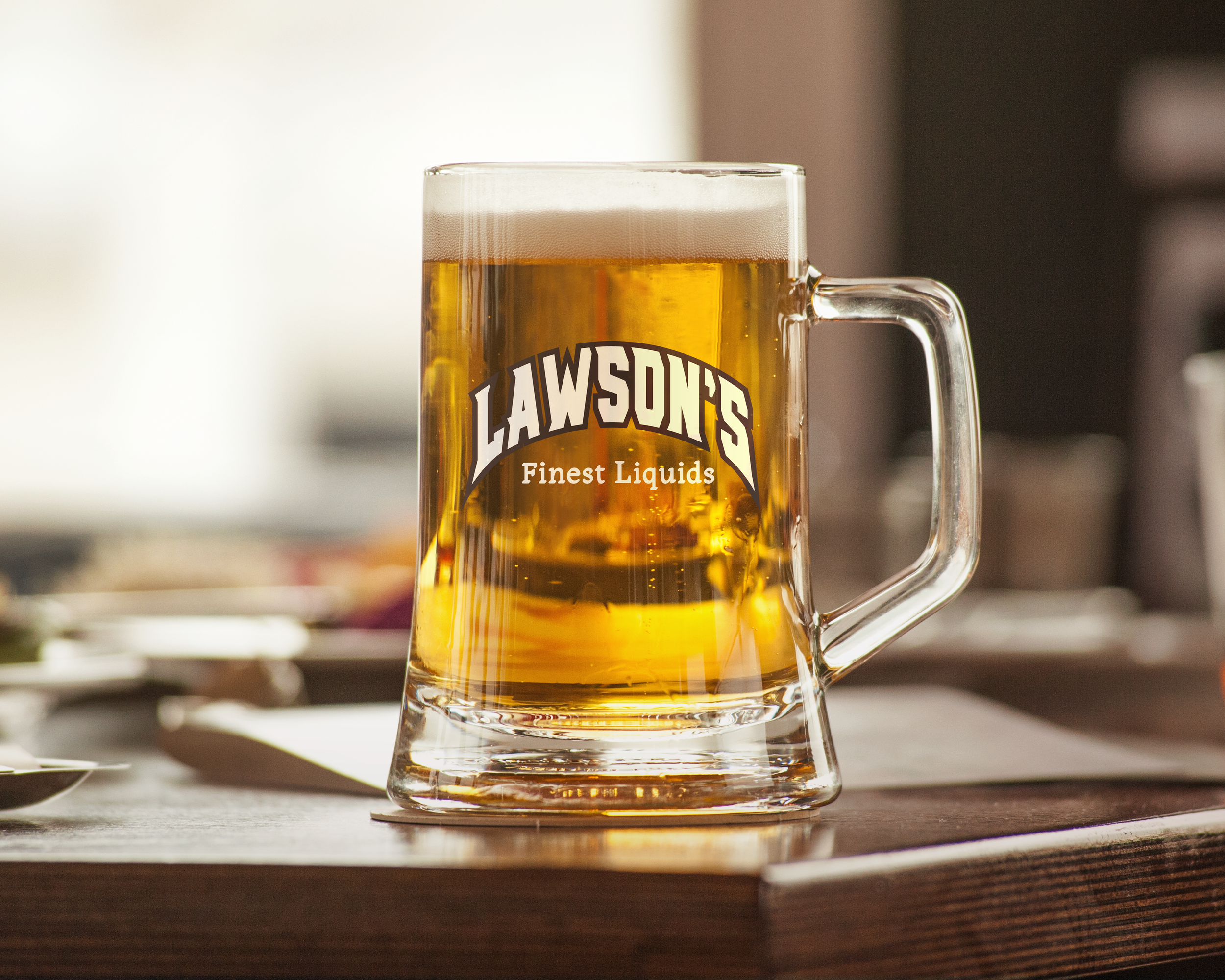
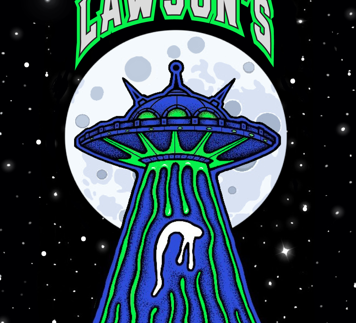
LAWSON’S FINEST LIQUIDS
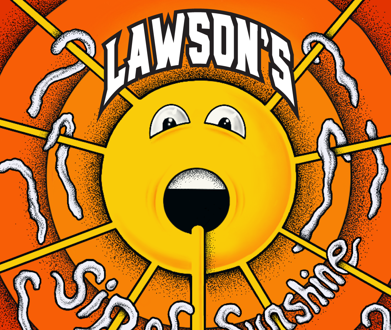
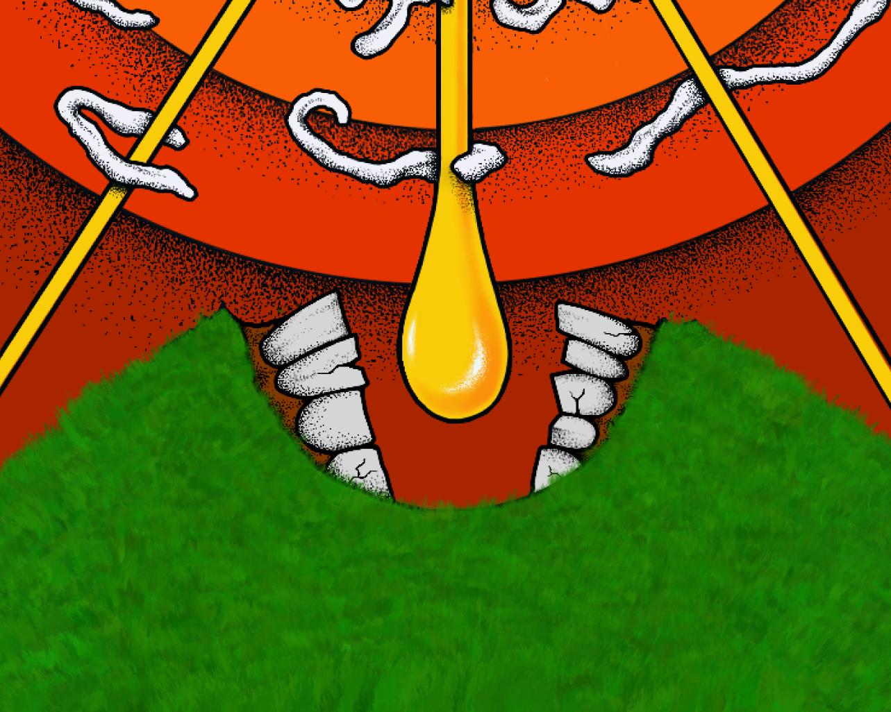
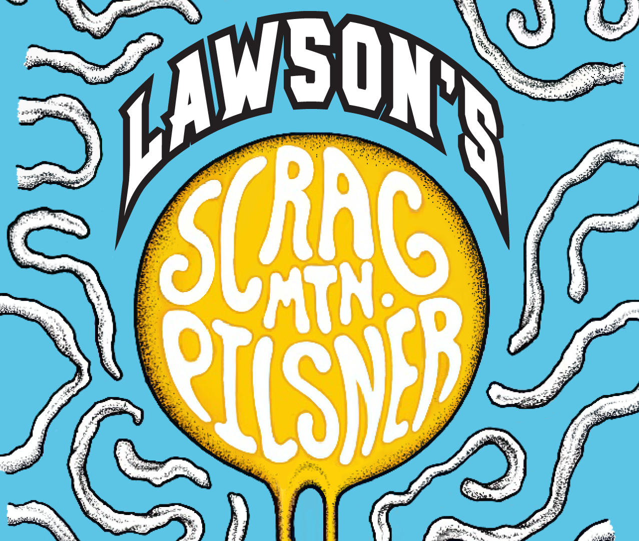
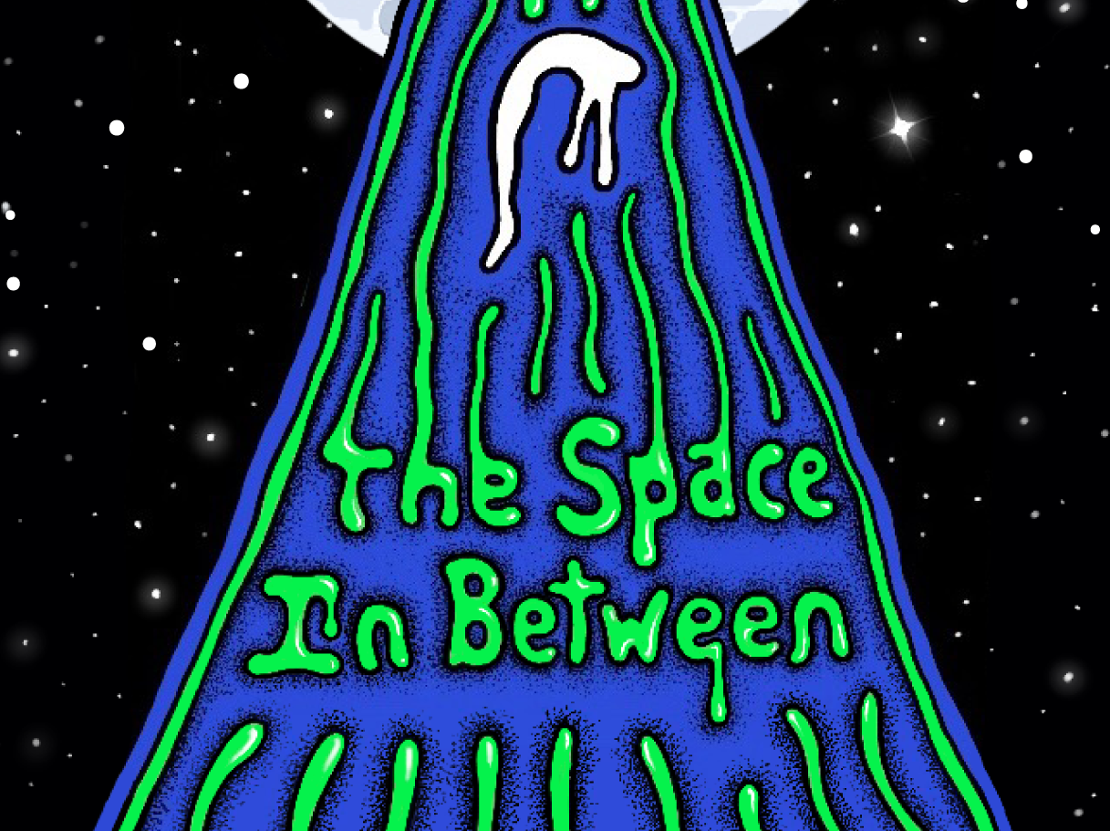
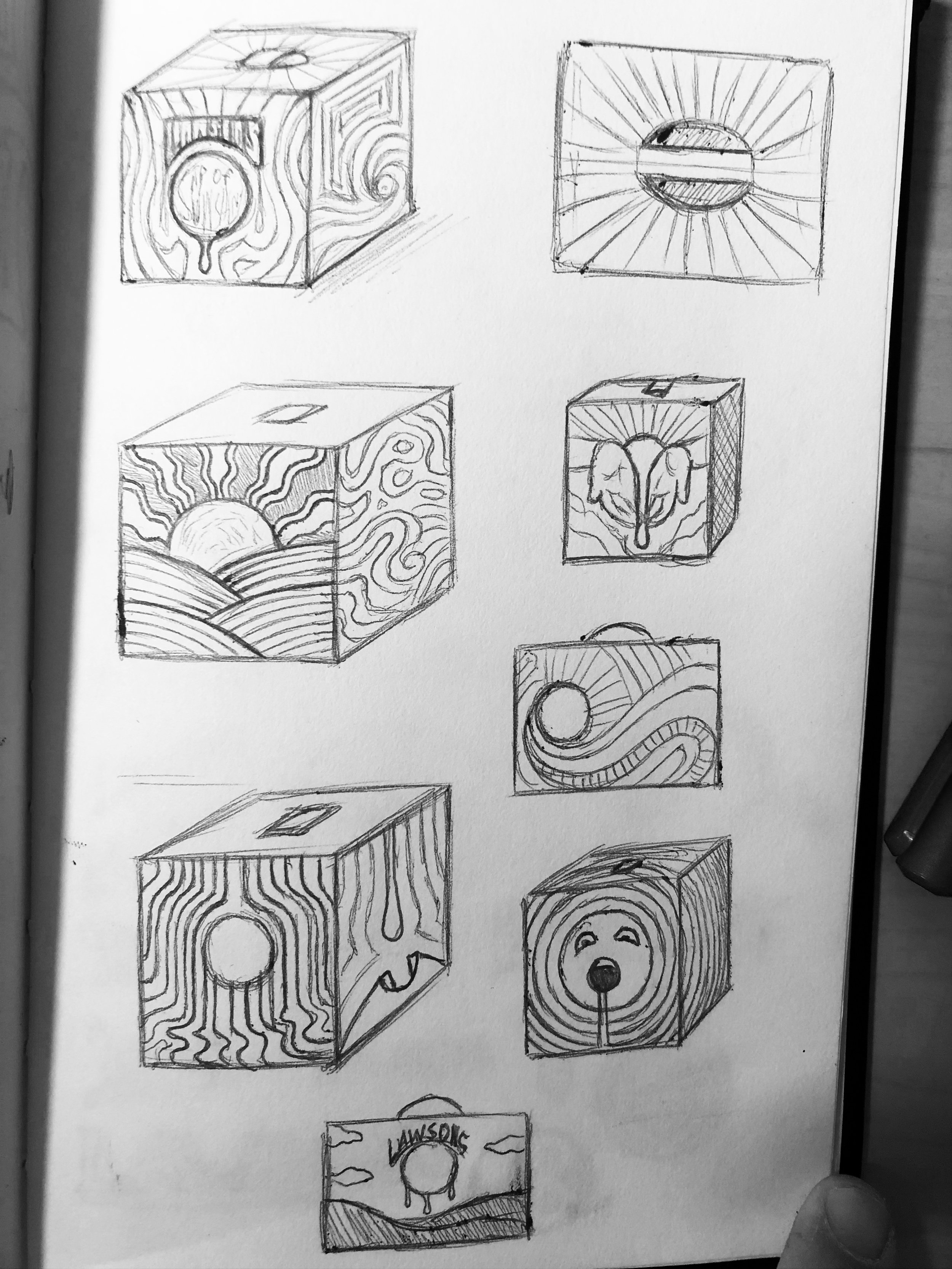
For us beer drinkers, there is something special about a can with amazing art. Beer cans these days are more than just a container for the beloved drink, but a canvas for art and creativity.
Being that Lawson’s Finest Liquid is a microbrewery creating delicous beer out of the beautiful mountains of Vermont, I felt that it is only fitting they should have art on their cans to match. The goal was to give the brand an edgy and rugged feel while also maintaing a colorful and trippy vibe.

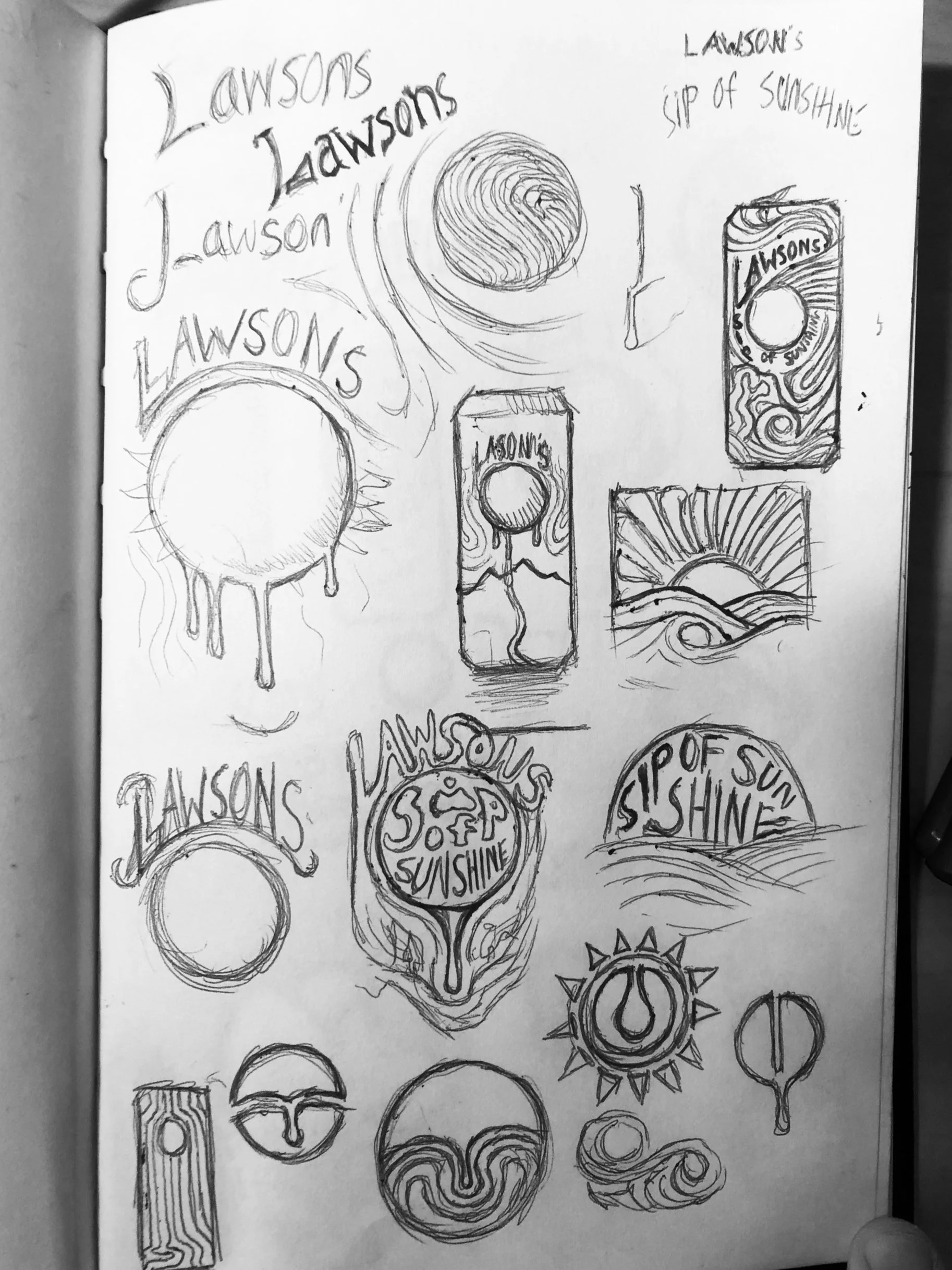
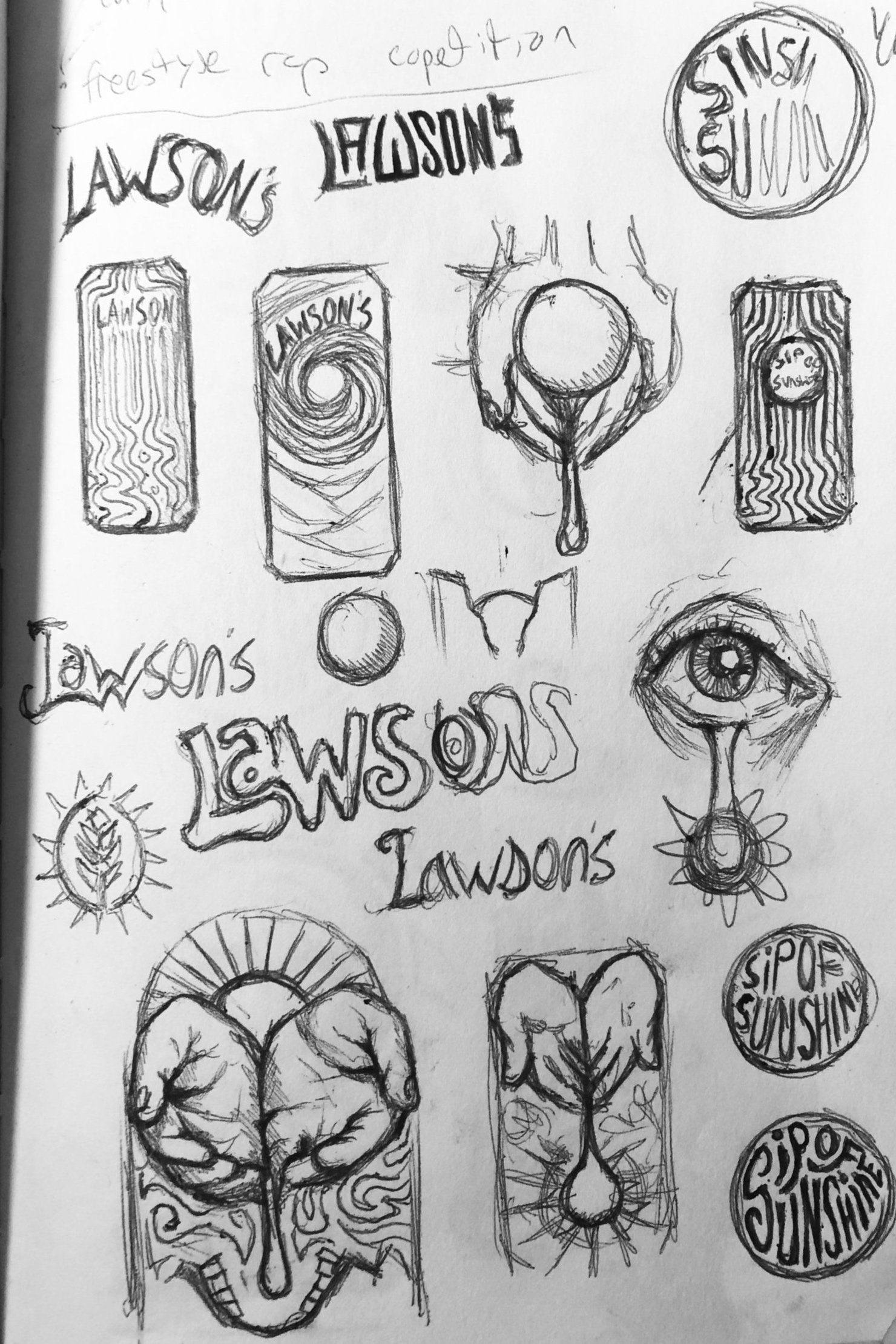
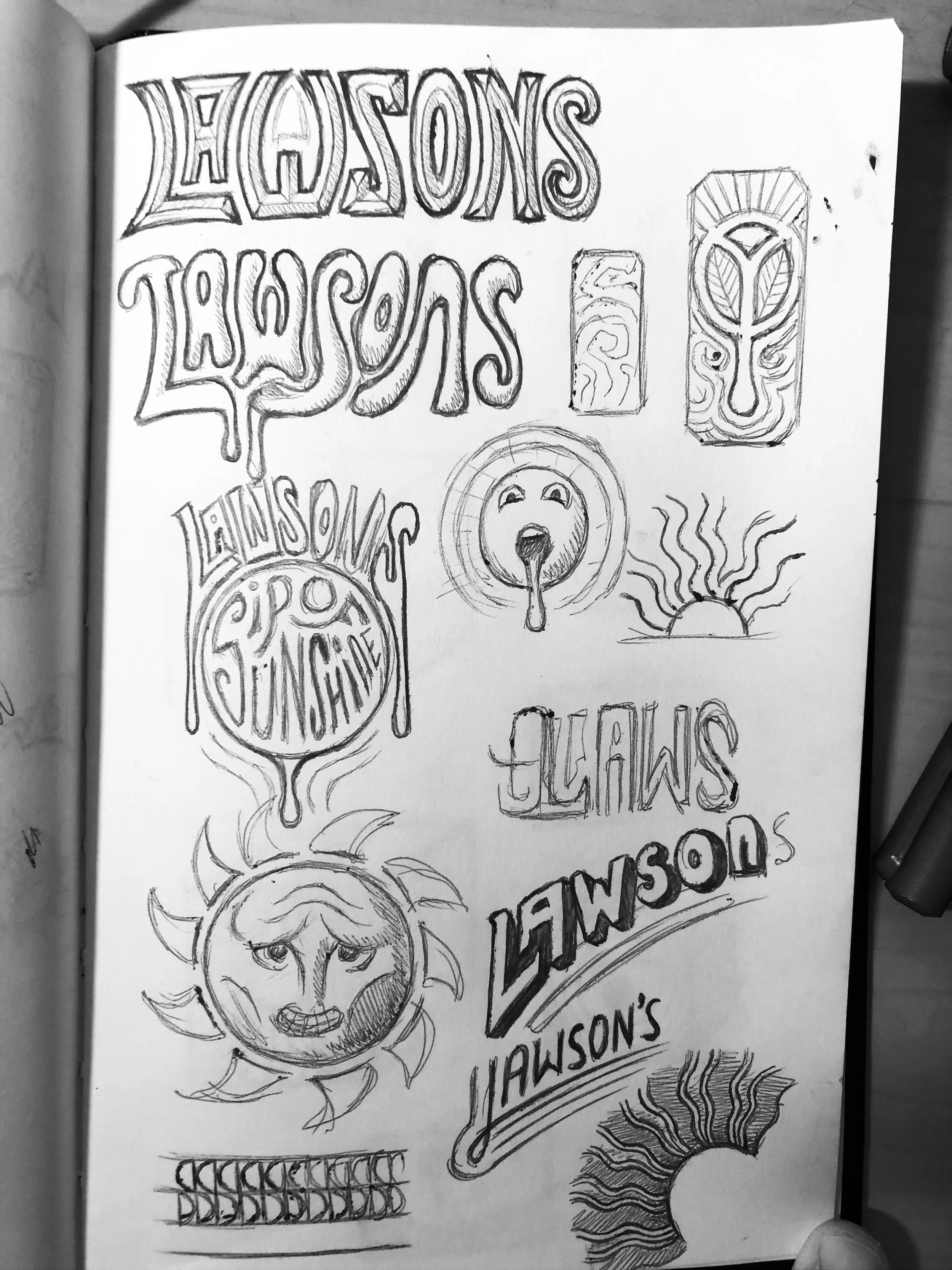
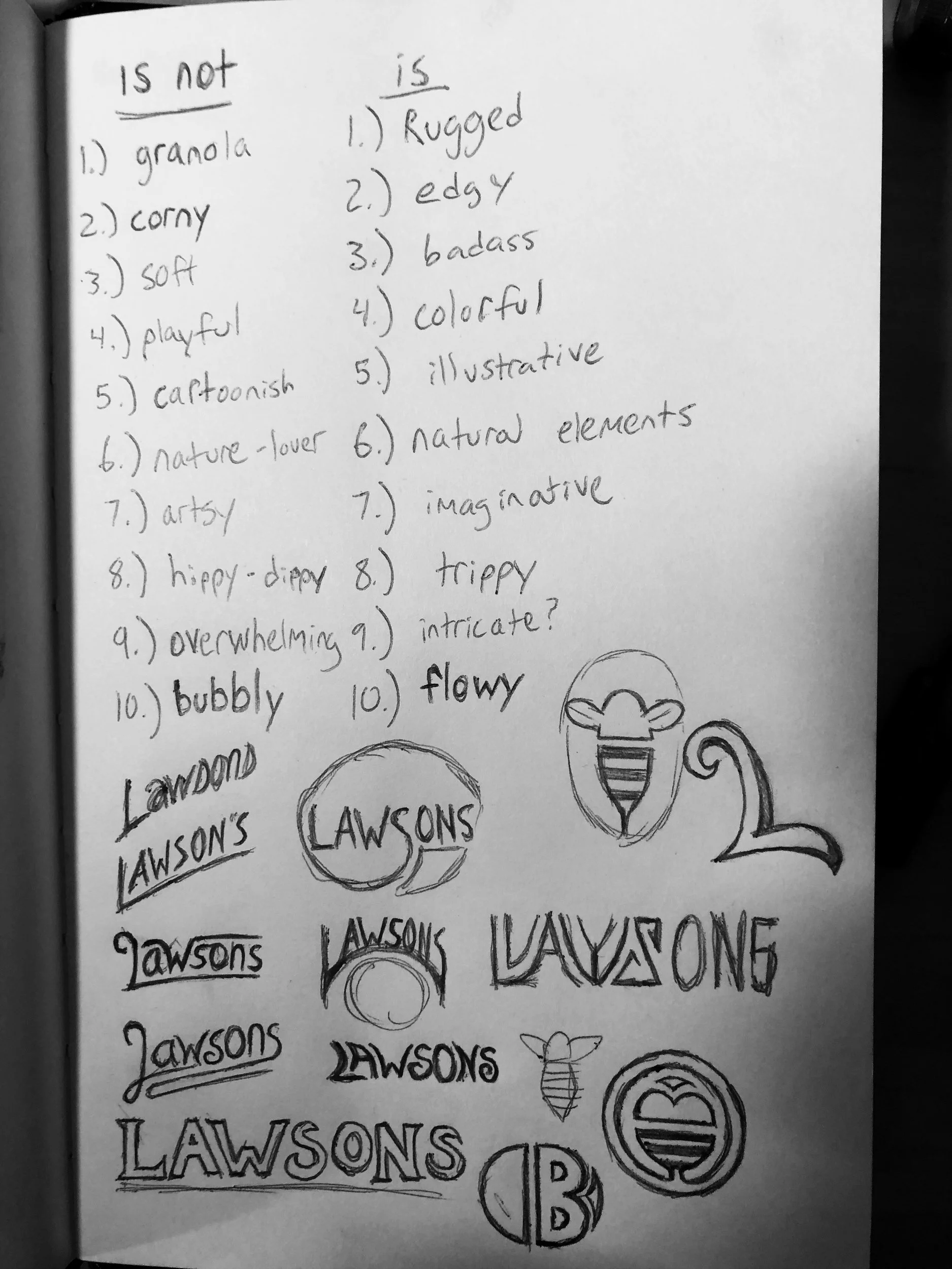
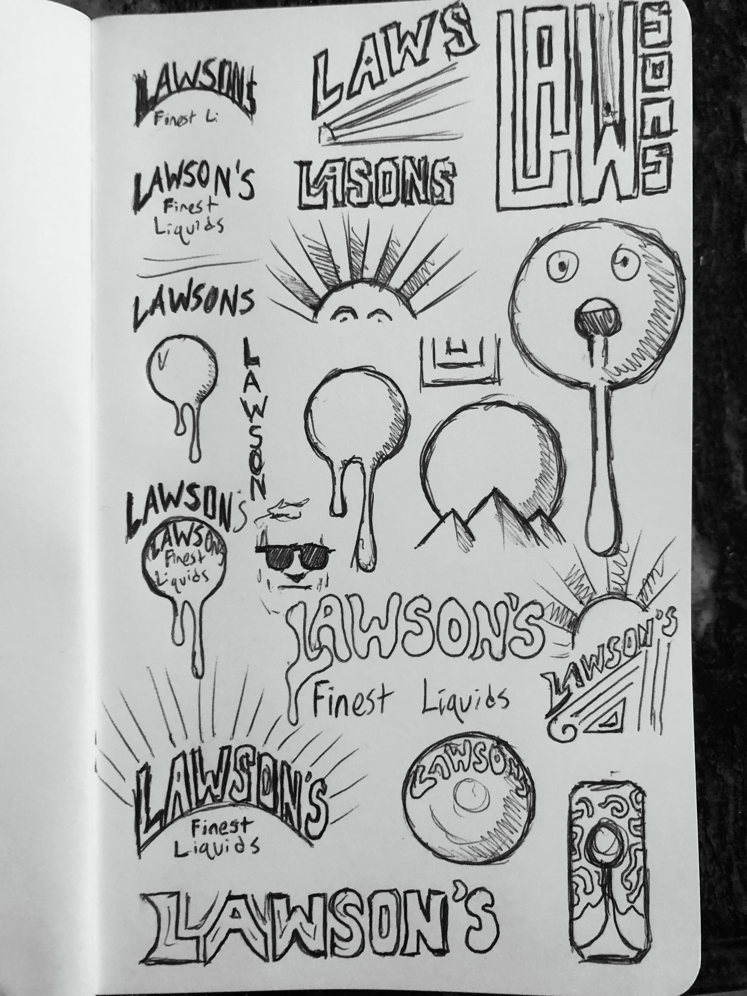
New Wordmark
The new wordmark will utilize thick and sharp typography to convey a rugged and edgy style, while also balancing out the colorful and trippy illustrations.